The goal
Design a feature that will give the user (Cyber analyst) the capability to manage an allowlist of alert types.
The problem
The company’s users are complaining about a false positives alerts – False positives alerts are legitimate actions marked as malicious, leading to alerts by mistake.
My role
UX/UI designer leading the dashboard and design from conception to delivery.
Responsibilities
Create paper and digital wireframing, low and high-fidelity prototyping, accounting for accessibility, iterating on designs, determining information architecture, and responsive design.
Inspiration board

User flow
Sequence of actions that the user needs to take.

Desk research summary
I read about industrial cyber attacks, including alert types and severities, from the following websites: US Government Cyber, EU Cyber (ENISA), and Cisco Company.
User pain points
1
There are false positives alerts
2
Share decision with stakeholders
3
User analyst doesn't know if input was received
4
Add a new type of vulnerability
Sketches
Sketching different versions of the same screen and one image of the new, refined version.


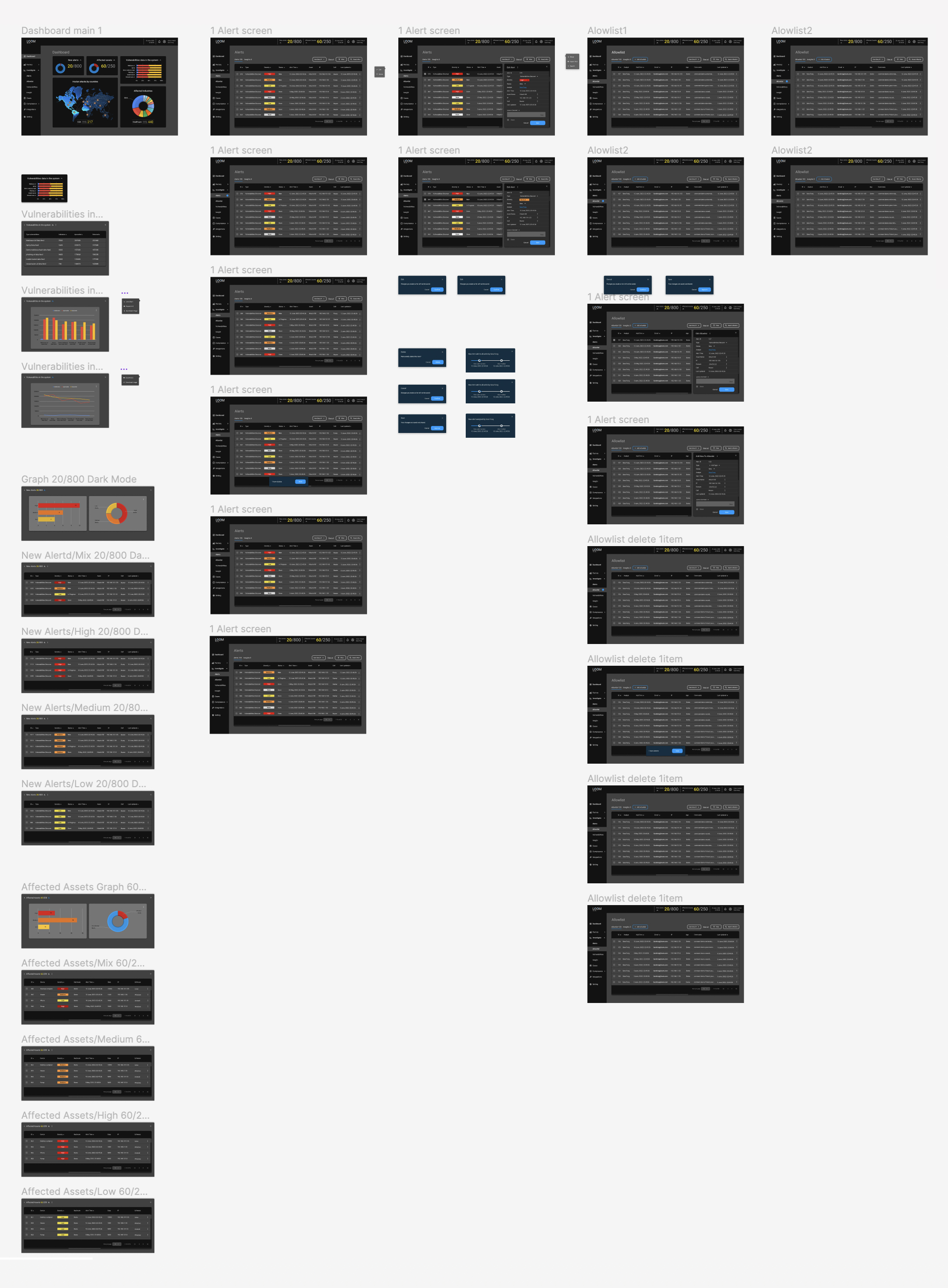
Allowlist mockups
High-fidelity prototype
The final high-fidelity prototype presented cleaner user flows for cyber security companies.
Loom cyber security
Dashboard
The product
I designed a dashboard for cyber security companies. The dashboard helps them to manage the services they offer for their industrial customers. Services included: Real-time Vulnerability Assessment, 360-Degree Risk Scoring, 100% Asset Visibility, Compensating Controls.


Pop-up edit menu, include add type


Alerts mockups
Cyber analyst actions
Wireframes
As the initial design phase continued, I made sure to base screen designs on paper sketch.


